|
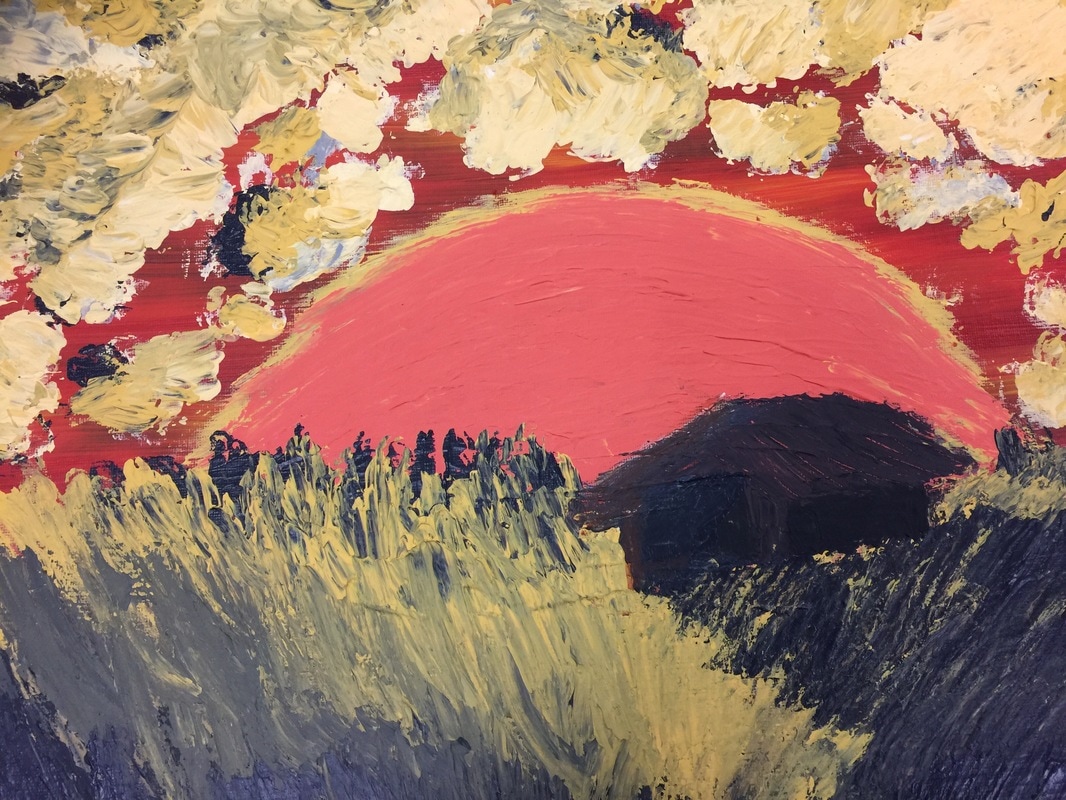
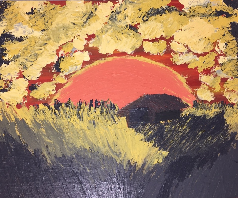
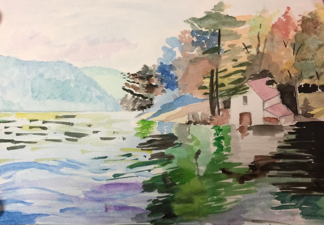
This is my acrylic finger-painting final on a white canvas. I wanted to try finger-painting because when I painted the orange base on the canvas, I took a while looking at it. I wanted to just smack my finger/handprints on it. Thanks to your help by showing me Iris Scott's finger-paintings, it inspired me to do it. Okay, looking at my project it isn't that professional or great. I tried putting in the values within the clouds but it just didn't blend well, or have the shaded affects. Within the wheat area, I was able to apply values which I was a little more satisfy with. This overall finger-painting project was to test out my finger-painting skills. I didn't really have a complete idea of what I wanted to display on the canvas, but I did manage to come up with a "little house on the prairie" kind of theme.
0 Comments
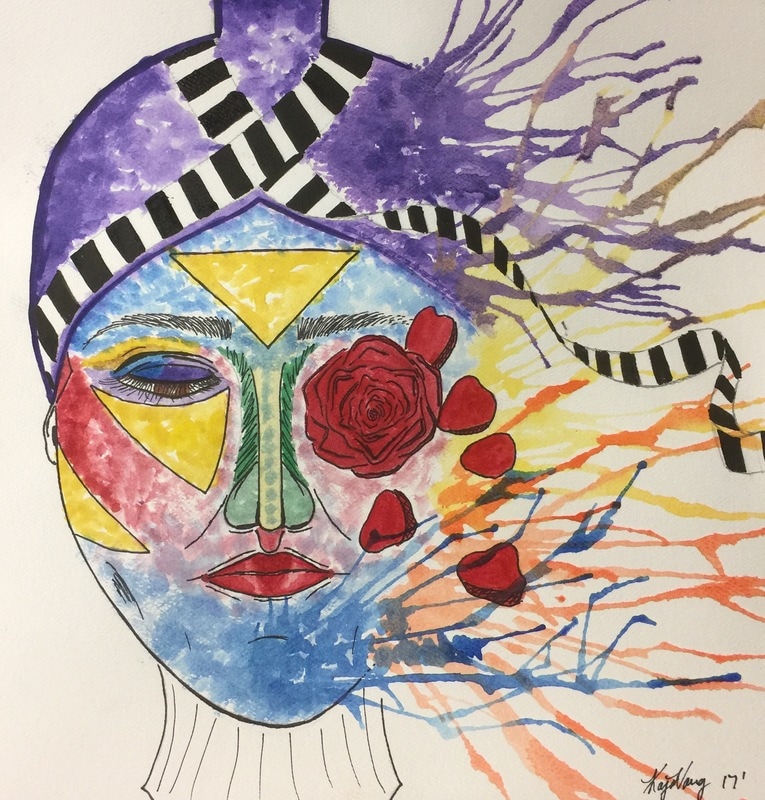
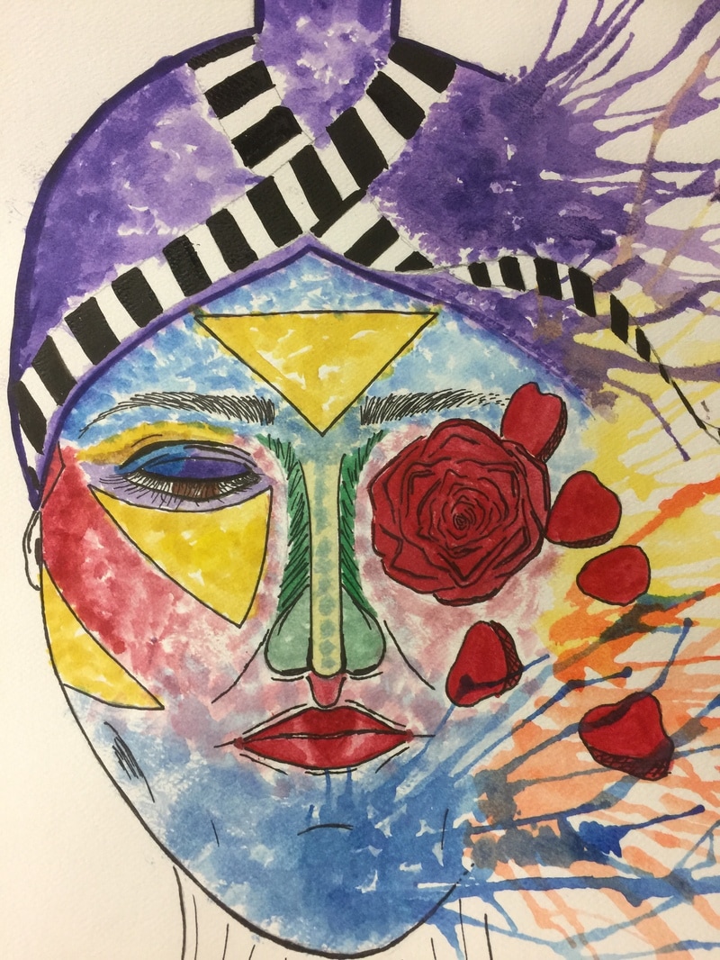
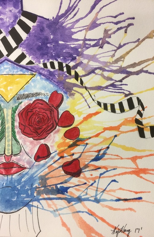
This is my self-portrait artwork. It probably doesn't look much like me, but that was the whole point. When I'm wearing traditional attire, I don't feel or look like myself. I feel like a woman. I feel beautiful. I have appreciation of it. This drawing / watercolor I created was to show the colors flushing out of my skin. Culture has been a great controversy for me because there are things that as a young Hmong woman, I am still trying to change without caring what the elders say. Elders have too much to say! In the portrait, I am keeping some of the culture and traditions, but slowly some are fading and dying off. The representation of the rose. There are a lot of Hmong Proverbs that can possibly describe this artwork, but I'm not trying to go into depth with the proverbs. All in all, this is my self-portrait!
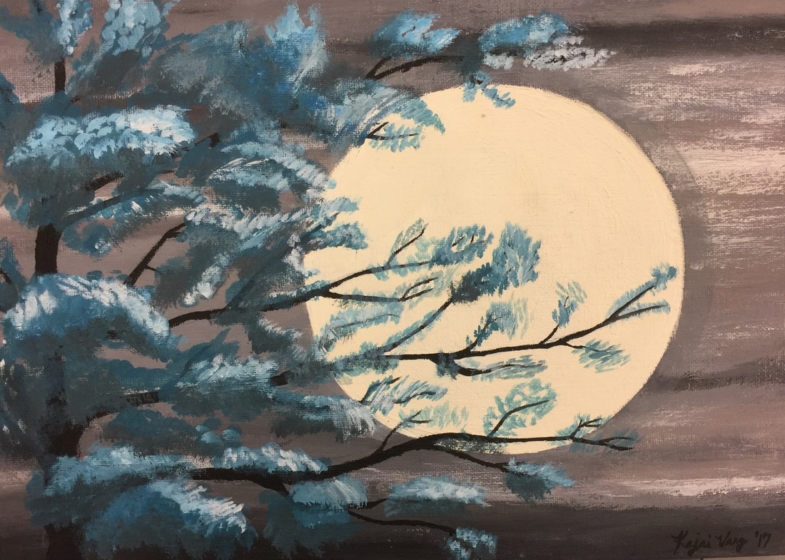
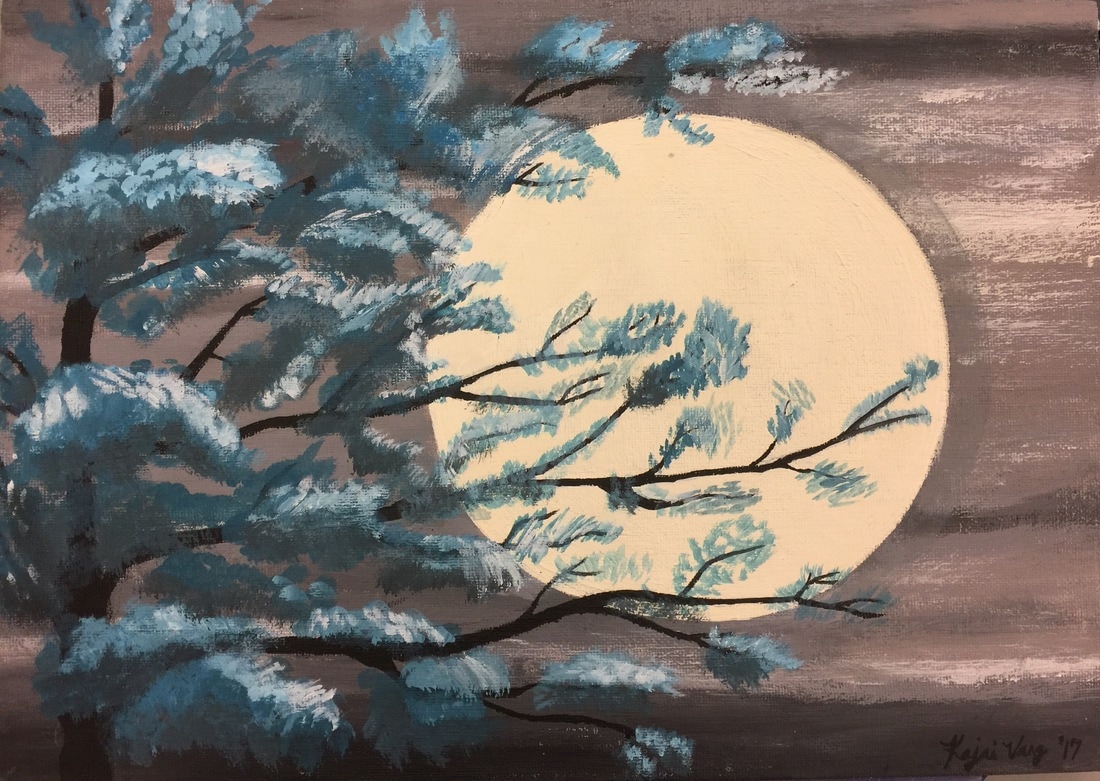
I did this painting on a small/medium sized canvas. The skills I represent within the painting are mixing colors with one another to make out a specific color needed. Like warm colors or cool colors. It was quite a challenge because there was many different shades that had to be mixed to get the certain color. One element that is within this painting is the contrast of colors. The big full moon brings out the tree and it's blue leaves. Overall this paintings was one of the first acrylic paintings that ever satisfied me. I've never ever painted with acrylic before and this scenery gave me a challenge!
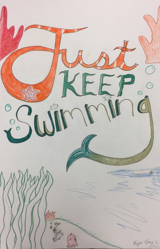
This is my word art on a 12 x 18 inch piece of paper. I based my word art off of Nemo and made it an aquatic theme. The quote "Just Keep Swimming" is said by Dory (the blue fish with short term memory loss). It is to motivate people that no matter the struggle or hardship you face, you just have to keep going. A skill that I had learn was to write the letter on a banner and shape it the way the banner moved so it would have the affect. On my art work, I wrote the first word in cursive, the next word according to the shape of seaweed (wavy), and the last word I tried making them dimensional with the first and last letters with a fish tail. How they relate to my practice with the banner is that the word "swimming" was made to start underneath the "J" and curve upwards, straightening out with the rest of the letters. The movement of the word "swimming" is actually swimming. This whole art work made me feel great because I love aquatic themes and somehow a great quote from Finding Nemo and the theme just had to fit right in. The extra detailed I made around the words made the word bring more meaning and know what movie it came from. More importantly, I didn't create the piece just because the movie is cute, but because Dory is right! No matter the hardships we face we have to "just keep swimming". The aquatic theme reminded me of home in Crescent City, CA. The beach and the ocean is what I miss the most, and that's why this art piece is meaningful to me.
|
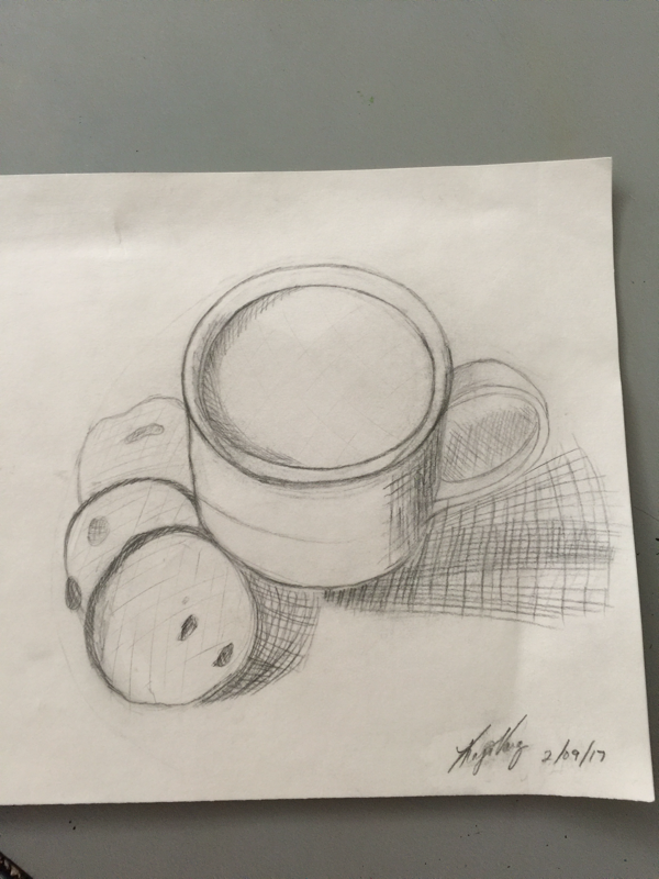
On the 9 in x 12 in paper, I drew a cup of milk and cookies from a top angle perspective. It looks like a light photograph with little dark spots. The skill that I learned and used for the work was cross-hatching. Instead of just scribbling in to shade, I used actual lines and wherever the area is darker, I would make the lines smaller. One element of this piece would be the contrast from light to dark areas. Contrast is what brings out the drawing's different perspective of how the cup of milk and cookies are being seen. Overall, I think the piece of art that I drew brought out a delightful feeling within. Most kids love milk with cookies and most adults still do as well. By drawing milk and cookies, it brings me a childhood memory of dipping my cookies in milk. This drawing also brings warm feelings of once being a little girl with my parents eating milk and cookies. This artwork pretty much sums up the feeling of a childhood.
|